
Angelica Ordonez
Graphic Designer & Illustrator
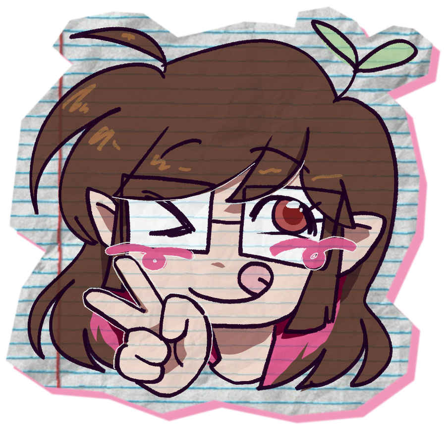
Hey, I'm Angie! I'm a graphic designer and illustrator who is eager to create approachable and engaging work to enhance consumer reliability and comfort.
My Work
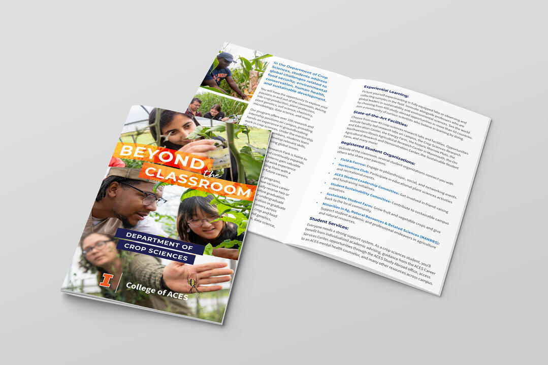
ACES Internship
Book Layout & Merch
Personal Branding

16 Page Comic
Personal Projects
Typographic Practice
About Me
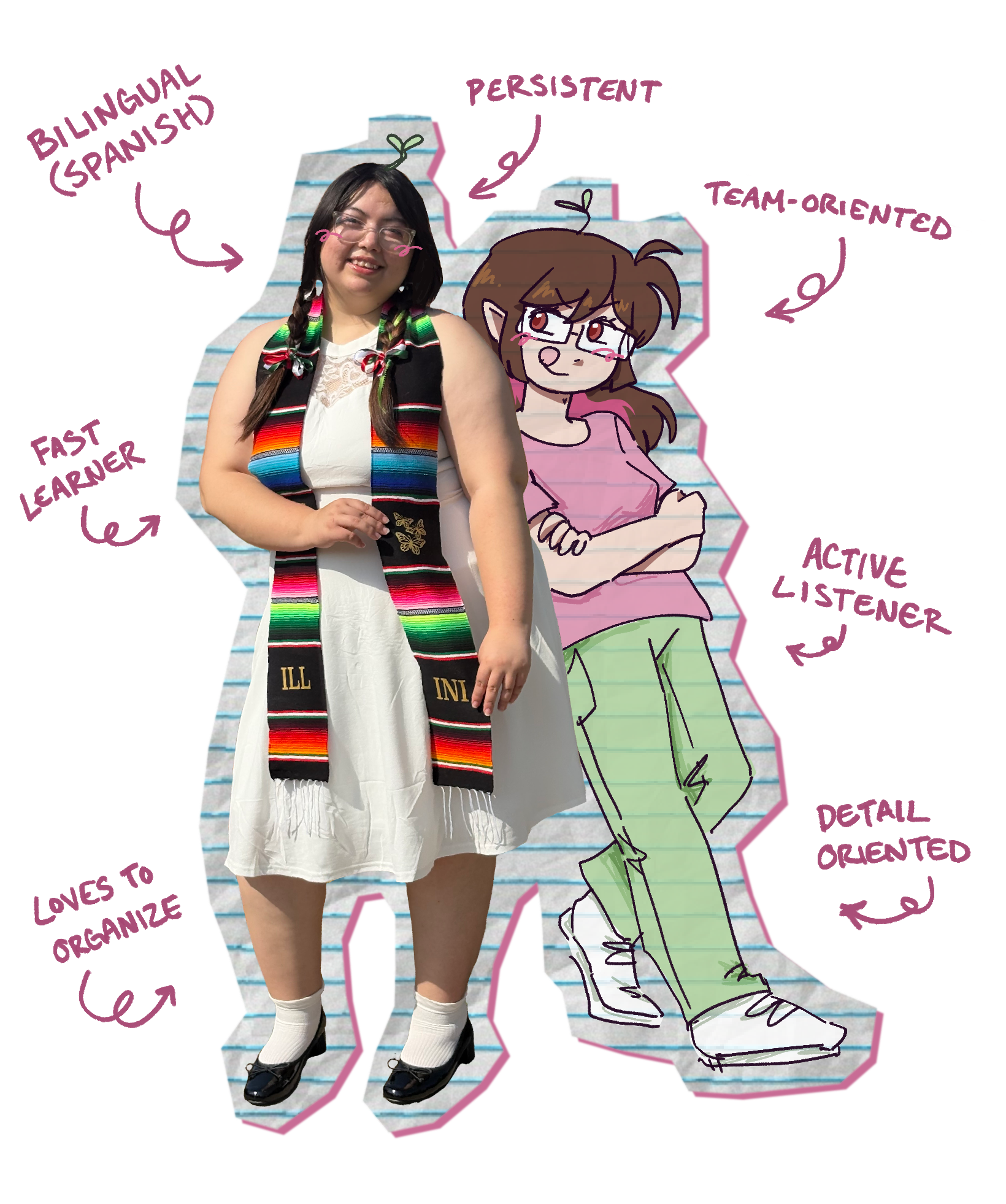
Call me Angie! I’m a graphic designer and illustrator based in Illinois. I graduated from the University of Illinois at Urbana-Champaign in May 2025 with a BFA in Graphic Design. I love all things silly, and strive to be the most authentic version of myself I can be.My goal is to facilitate communication through design. Being particular with color usage and surfing through hundreds of typefaces has become an instinct for me. When words are limited, a graphic designer’s work becomes a bridge. Art and design grants a chance for an artist to deliver a message that inspires feeling, understanding, and familiarity. First impressions are important, which is why I aim to create friendly and approachable work to enhance consumer reliability. The passionate, vigorous, and vulnerable human touch in graphic design and illustration is what will forever inspire me to continue creating.
When I'm not working...

I am a huge fan of playing RPGs and Indie Visual Novels. I enjoy Rune Factory 4, Minecraft, and a variety of silly dating sims.
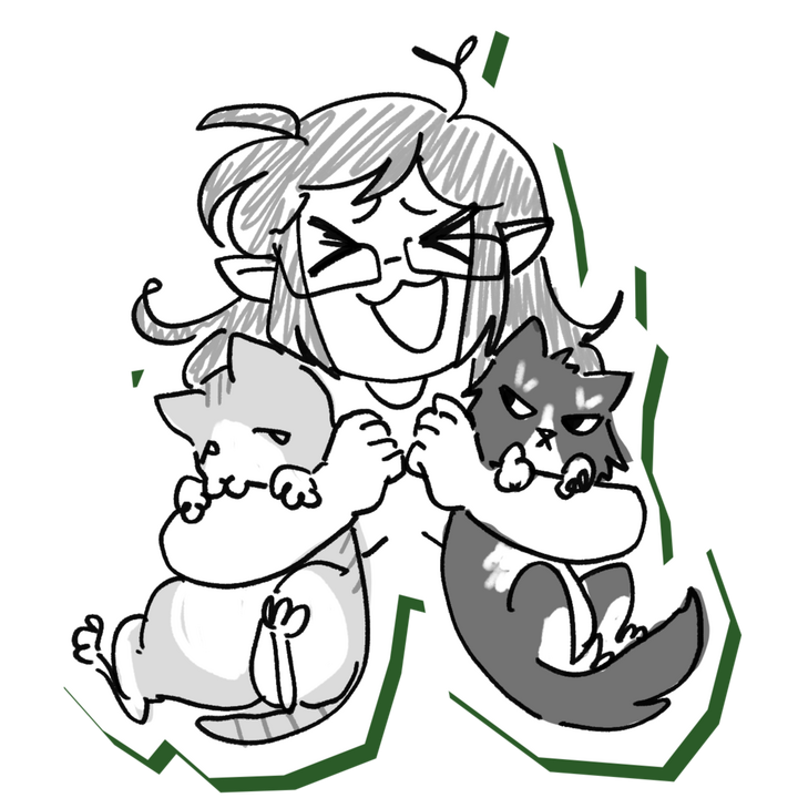
I’m a family girl. I adore spending time with my siblings, friends, and partner. I’m also always spotted talking to my cats, Ollie and Megatron!
I watch a lot of anime and RomComs! My taste in entertainment is either life-changing storytelling, or something full of corny jokes and heartfelt moments. There’s no in-between!
Let's Work Together!

ACES Internship Work
February 2024 - December 2024
I was given the opportunity to work alongside the Senior Graphic Designer of the College of Agricultural, Consumer & Environmental Sciences at the University of Illinois at Urbana-Champaign as an intern.
Skills
Tools
Brief
I was tasked with designing a variety of communications for the College of ACES. This included but was not limited to: pamphlets, awards, shirt designs, handouts, and other merchandise. All of these had to follow the University of Illinois at Urbana-Champaign’s brand guidelines.

Class Curriculum Pamphlet

Award Pamphlet


Result
This opportunity taught me a lot about time-management, and working with efficient team workflow in order to bring a project into completion. It also taught me about communication and revision under short deadlines.

Class Findings Report
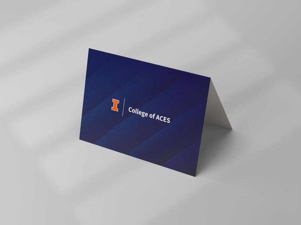
Notecards

ACES Class T-Shirt

DNS T-Shirt



Book Layout & Merch
January 2025 - May 2025
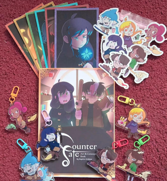
For my capstone, I focused on creating a mock up of a book drop, along with merchandise. I wrote an art and concept book and created a layout for publishing, while also creating merchandise that would be common in a fandom’s marketplace. View and read the book here.
Skills
Tools
Brief
This project was inspired by my love of creating fandom merchandise, and a love letter to my own original characters. I experimented with a limited run of keychains, prints and photocards of each character, logo design, t-shirt production, and finally a book. A lot of the merchandise designing was about taking accurate measurements of my materials. The one I struggled with the most was the t-shirt as it was a learning curve in being able to get all the whites in place for pressing designs onto the fabrics. I made sure to print individual pages of my book as well before sending it off to be printed, and experimented with hand-binding as well. Process Book Below.
Result
I made a total of six different acrylic charm designs, and reused them for the stickers. I went through two rounds of printing the charms in order to figure out how to make the designs more durable. I also illustrated six different portraits of my characters, and tested the colors for printing individual photocards as well. I illustrated many images for my book as well, and wrote a total of 9,178 words for an 87 page book. Our museum helpers were the ones who set up our displays, so while there’s a couple of things I wish I could’ve input there, I’m still proud of how it all looked together.

Book & Merch Photo

Family in T-Shirts



Personal Branding
January 2020 - Present
Since 2022, I’ve been attending art shows as a vendor on campus. I’ve sold a variety of stickers, prints, buttons, and even some crochet plushies! All of my merchandise is designed completely by me. I’ve made almost 100 sales online, and even more than that in in-person sales.
Skills
Tools
Brief
I’ve been managing my online presence since 2015, with around 9k followers on Instagram, and over 100k on TikTok. I’ve been on social media for years, but rebranded to teacupweeb in 2020. My mission with teacupweeb is to make as many people in the world smile, and my branding represents that by having assets that spark familiarity and comfort. I strive to have my art feel vulnerable, and push to have a very homemade and human style.

Booth Setup

Brand Assets


Result
The juxtaposition between rounded shapes and sharp triangles plays with comfort and playfulness. Most of my illustrations are cell-shaded and utilize very sketchy brushes in order to feel approachable. I’ve always felt that the colors pink and green have a very nice popping style, and I believe the strength in magenta brings the two together into an eye-catching setup. Gambado Sans Forte has a very sweet balance of boldness and curves, along with a childish bounce along the letters.

Strawberry Stickers

Rat Sticker Sheet



16 Page Comic
March 2024 - April 2024
This comic was made over the course of a month. It was made for my Manga and Illustrations class, where we learned how to carry out a storyline through 16 pages.
Skills
Tools
Brief
This project involved creating a standalone 16 page story. We studied different paneling choices, and then also worked on page-flip moments that kept the story moving at a clear pace. I experimented with my thumbnails and went through many rounds of revisions to get the story clear, but still within the page limit. We were also encouraged to try and use Japanese comics as a clear influence, by copying sound effect styles, and screen toning our pages.

First Draft

Second Draft (Simplified First)


Result
I chose to tell a story about a prince-type character and his bodyguard, inn a little magic world that I’ve conceptualized for a couple years. In this world, telling someone your name can be something that is used against you, just like how curses function in real life and stories. I wanted this 16 page story to show a conflict that ends with both characters learning to care for each other. In the end, I had a lot of fun putting this together and experimenting with different manga techniques.

Personal Projects
Variety of Dates
This section is a collection of illustrations and branding that I’ve done for personal projects. This involves projects for family, and also for friends.
Skills
Tools
Illustration Collection
These were flower drawings in a lineless style that I created to play with lineless art. The concept was to make them feel very immersive in a way where they felt like they could be photographed, but in a fictional world.

"Invasive"

"Fly on Venus"

"Witch's Tonic"

"Botanical Collection"


Chiblings Logo
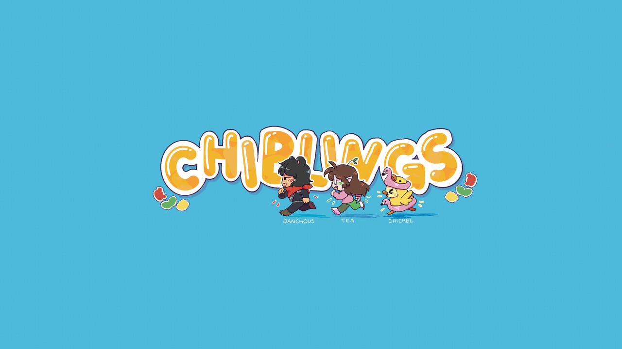
I created a YouTube Profile Picture and a Banner for a channel I share with my siblings. Our hopes are to create videos together so we can look back on them and our memories. I tried to make it feel official and involve our personalities and personas.

Chiblings Logo

Chiblings Banner


Milestone Doodles
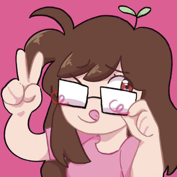
These are doodles I've made featuring my "persona" who is a character I've made to represent me in my artwork. I often doodle myself when I complete a milestone in my life, so that I can look back on it later and compare my art style, and also fondly remember the time. It's almost like keeping a journal.

Grad Doodle

7th Anniversary

2025 Birthday

2026 Birthday



Typographic Practice
2022
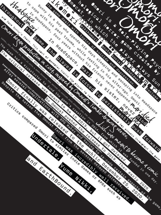
Themed typographical poster concepts that were a way to play with typesetting and creating interest with whitespace.
Skills
Tools
Brief
This was a poster project assigned to me where I was tasked to create posters for something I loved. I created a poster about Omori, which is a psychological thriller RPG. I wanted to create interest in the poster by playing around with white space and also the layout of the text in these posters. While the content wasn’t necessarily graded, my hope was to still have it be readable enough to intrigue others to play it.

First Draft

Second Draft


Result
I went through various different ideas when creating this poster. Because it was a psychological horror, I wanted to make sure it had a more creepy and rushed feel to the typeface I chose. I also wanted to keep the colors black and white because in studying the color palettes of the game, the main character keeps his black and white persona the entire time.

Third Draft

Final Draft

